
Cambrooks
You could be forgiven for thinking that nuts are nuts. But when we met the team from Cambrook we discovered that nuts can be a work of art. As the original founders of Dormen’s Nuts these guys had learned a thing or two about quality and wanted to launch the ultimate range of caramelised nuts handmade right here in England.
They needed us to create a brand identity that could be applied to a range of packaging and marketing materials from trade stands and stationery to their website. The thing that struck us immediately about these nuts was their amazing shine.
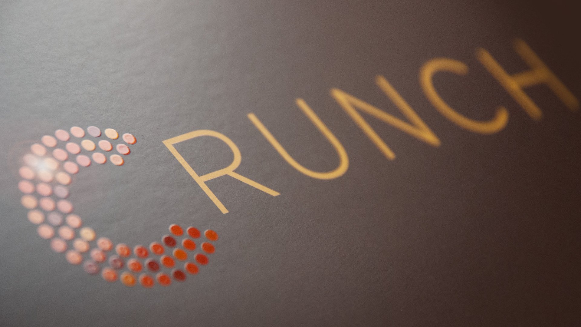
This kind of fine glaze is unlike other caramelised nuts available in the UK and can only be produced using the same gentle panning method that is commonplace on the continent. We created the strapline ‘brilliantly caramelised’ to capture the unique shine of the caramel in a very British tone. To bring a little glamour to the otherwise earnest nut aisle our design puts their name in lights, making them famous for their brilliantly caramelised nuts. The dazzling C of Cambrook draws on the 'brilliance' of the product to act as an icon for the brand across a range of packaging and other communication.


“When we started Cambrook Foods we asked Beeson+Beeson to create our branding and packaging. From the initial getting to know us phase, they were quick to understand what our product and brand positioning was all about and produced some very well thought through alternative design routes. The packaging design we chose has been extremely well received and has given us an original, distinctive, and instantly recognisable shelf presence. Not only were Gareth and Mel efficient and easy to deal with throughout the different stages of the process, but they were honest in presenting their own thoughts and opinions even when they differed from his client, which is something I value.”
Michael Brooks - Co-Founder, Cambrook Foods Ltd.